Project Discipline
Branding and Guidelines
Collab
M&C Saatchi
Creative Director: Sharon Edmondston
Copywriter: Chris Brailey
Retoucher: Richard Hughes
BWS How Convenient
BWS wanted to express their unique selling point - the easiest way to buy drinks in Australia. With over 1300 stores nationwide and drink delivery on demand via the app, they are convenient in stocking what the locals love, updating the range as tastes change and delivering drinks ASAP. This gave birth to the new platform "How convenient" and along with it, a fresh new look.
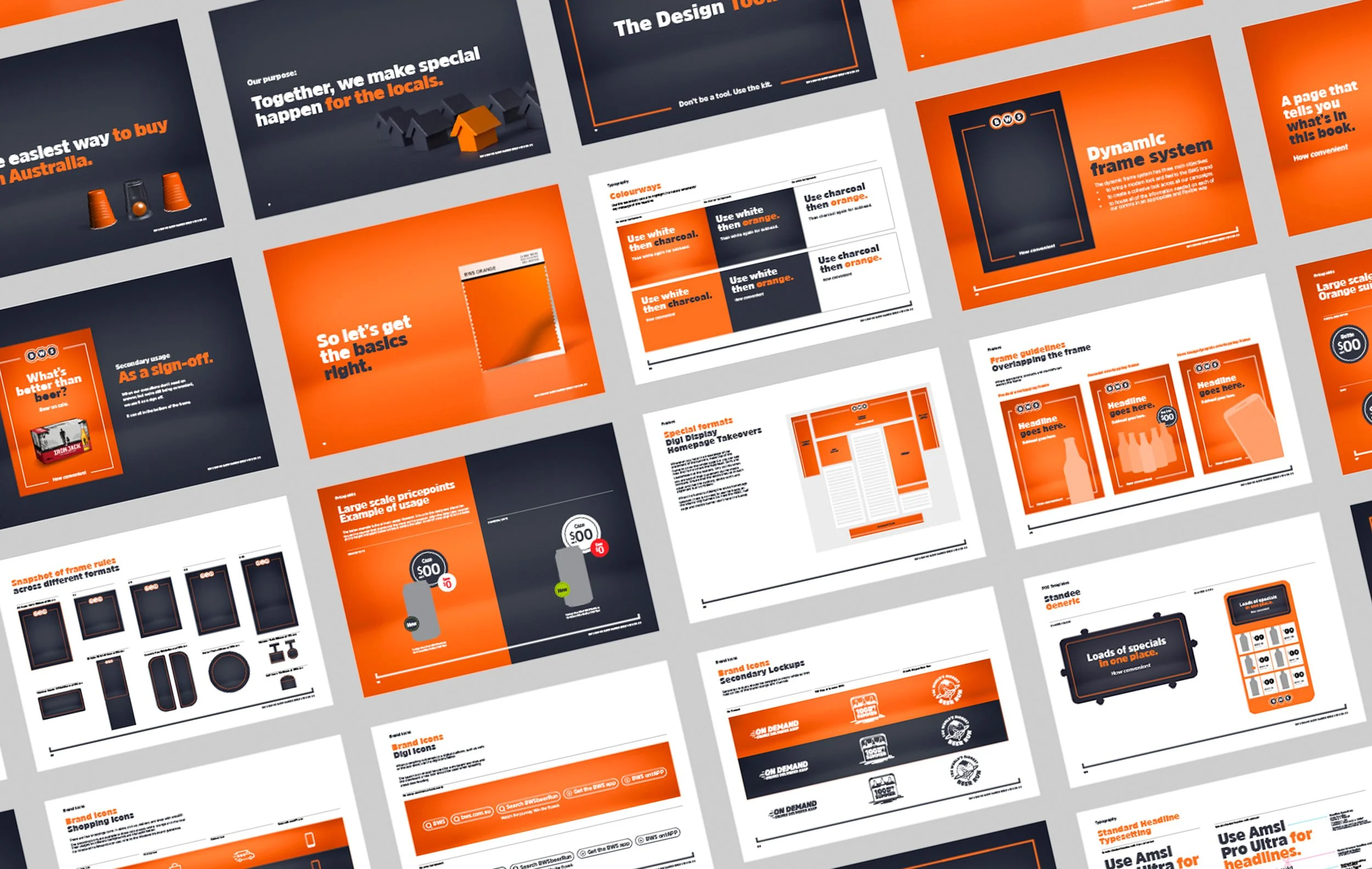
BWS had a design problem: with all the range of campaigns they run throughout the year, there was a lack of visual cohesion that reminded the customer that it was a BWS ad. They needed a design system that still sung "BWS" yet still allowed the flexibility and playfulness for each campaign to have its own personality.
We introduced a fresh new art direction for BWS imagery that was a playful nod to the tagline and brand personality. The framing system to allow campaign backgrounds to be incorporated but still feel like BWS. And we also introduced a studio background suite to bring dimension and elevate their advertising - even if it was as simple as a retail product and price poster.
In this year long project I worked directly with the creative director at M&C Saatchi, Sharon Edmondston, to create the design toolkit, templates, and rules in this 130 page Brand Guidelines document that would be used by all of BWS' group agencies.